“I never take advice from anyone who would never take their own advice.” – unknown
It’s been an exciting few years (we’re turning 20 in 2022 — can that be right?!?) at Sublime Designs Media, and while we’ve been heads down in projects, helping our clients stand out in an increasingly noisy and saturated marketplace, we realized it was about time to do the same for ourselves.
In our early years, we were focused mainly on the design aspect of marketing before moving into the marketing strategy and storytelling space about a decade ago. As we’ve continued to evolve the last few years, our team has grown to 11 people and we’re honing our craft while expanding our offerings. While we continue to work with bigger clients and take on high-profile jobs in three main areas, including branding and rebranding, creative support, and creative marketing strategy (including storytelling for pitches and other high level presentations), we knew it was time for a website that fully reflected who Sublime Designs Media is today.
We know firsthand that your brand is so much more than just your logo, mission, values, and messaging (though those are certainly important!). There’s an entire design system on top of it. And that system should tell your story in a way that’s authentic to you. So when it came time to design our new website, we knew it needed to convey the level of creativity we bring to every project – whether it’s a brand we’re building, a story we’re telling, or a design we’re creating. When we work with our clients, our goal is to make them different from their competitors in a way that’s true to who they are. And creativity is the core of who we are.
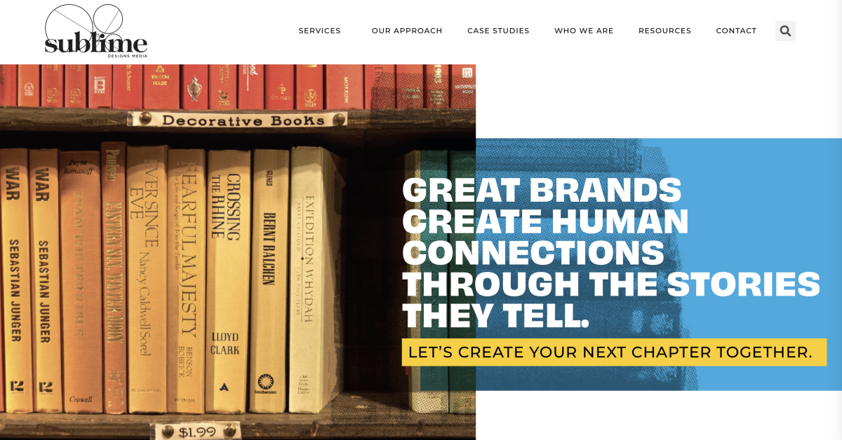
As Sublime Designs Media’s founder, I wanted this website to reflect my personality and aesthetic, which includes color, life, and movement. As you may recall, our past color palette was fun (that bright yellow!) and we didn’t want to lose that in this new iteration. We took that boldness and added brighter colors that build off that foundation. We combined this with big fonts, that when you’re reading, almost feel like you can hear us talking (yes, in a very enthusiastic voice). We chose imagery that conveys movement, as we continue to move up in the world, and icons that mix old school print style with our signature bright colors to add a modern twist.
So many agencies out there can feel cold and impersonal. That’s not who we are or how we operate at Sublime Designs Media. So above all else, I wanted this website to feel as big as we feel in this moment while being welcoming and fun. And I like to think we achieved just that. I hope you enjoy it.
We’re excited for this next chapter and are grateful to have you along for the ride. You can see the fruits of our labor and visit the new website here!
