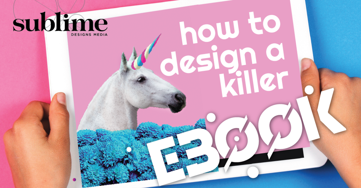
By now, you know that content marketing is an effective way to capture the attention of current clients and potential customers, as well as a powerful supplement to your marketing strategy. Whether you’re diving into the process of designing an eBook yourself or working with a creative team like Sublime Designs Media, you can increase your book sales exponentially by keeping a few simple rules in mind.
Rule 1: Judge That Cover
Your potential readers will judge your book by its cover. While it’s true that spending time and money beautifying the inner pages of your book matters — it only reaches readers have already decided to download your eBook. In the content marketing world—contrary to what your favorite grade school librarian told you—your eBook’s cover matters most of all.
Your cover is the storefront for your content marketing offering, and it’s worth budgeting for a fresh, enticing and approachable design. In a time when there are literally millions of eBooks available on thousands of subjects, cover design is one of the few areas where you can make a big impact.
Rule 2: Make Sure Your Design Can Scale
Make sure your cover is scalable. It’s not just about having a gorgeous design—it also has to be flexible enough to turn heads, whether it’s shining from a beautiful high-res tablet, or whether it’s the size of a postage stamp on a mobile phone or black & white eBook reader. And you don’t need an art degree to know if the book cover works as a thumbnail—if your design team sends you a mockup you love, just zoom out a bit and squint. You might not be able to read all the text, but there should still be something eye-catching about it.
Rule 3: Pick a Design Theme
Standing out in the sea of self-published eBooks can be a daunting prospect. In your own online book browsing, you’ve probably noticed a range of covers: some are basic, just a title and generic stock image while others stop you in your tracks.
So how do you get your potential reader’s attention? The best eBook designs start with a theme. Your theme can be a style of art (impressionism, art deco), a decade (the 1990’s), a style of illustration (anime or comic books) or even something that inspires you in nature (the ocean, forests).
Once you choose a theme that stokes your imagination, connect it back to the content of your eBook. For example, one of our clients released an eBook about old-fashioned customer service, and a vintage, old-timey aesthetic dictated the design. Another one played off the “wave” concept with a surfing/ocean themed eBook about Salesforce Wave Analytics.
If your eBook is about where your industry is headed, you might pick ‘the future’ as a guiding theme. You might drill down even further and decide upon a science fiction aesthetic. Pick one (maybe two) contemporary or futuristic fonts, and one strong graphic or stock photo that has something to do with your idea. Pick borders or other graphic accents that suggest futuristic technologies or shapes. In this way, your aesthetic idea for the cover can serve as your guiding principles for the interior—chapter headings, photo selection, pull quotes and more can utilize some of the same elements.
Rule 4: Think Outside your Brand’s Box
If you’ve thought a lot about your company’s brand, you might be recoiling by now. Why would you release content that favors a fun aesthetic idea when you’ve put such extensive consideration into the construction of your branding? We’ve found that the most successful eBook offerings break the mold and stretch the limits of an organization’s brand. If your goal is to sell eBooks, the cover should be a creative playground that captures readers’ attention and relays the high value of the content you’ve written.
At Sublime Designs Media, we’ve found that our content marketing clients who push their company’s creative limits often yield the strongest eBook sales. Get in touch with us today to get started.
